Candlestick chart patterns are one of the most widely known techniques that claim to “predict” the market direction inside technical analysis circles.
The development of this technique goes back to 18th century Japan, and it’s attributed to a Japanese rice trader.
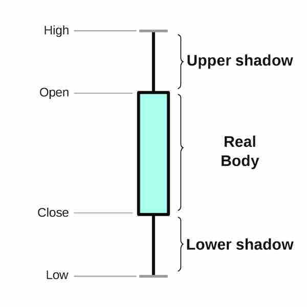
It consists of finding patterns based on charts made of the above figure with prices over a period of time. There are many patterns, old and new, available on the internet. But the question is, do they really work as described?
Let’s use machine learning to find out.
There are multiple academic papers, books and websites testing these patterns in different instruments with statistical methods. Results are mixed.
If the patterns can really predict the market, training a machine learning model using them as features should make it able to predict the returns of a traded financial instrument.
Let’s dive into the experiment!
THIS IS NOT INVESTMENT ADVICE! THE PURPOSE OF THE ARTICLE IS TO BE AN EDUCATIONAL MACHINE LEARNING EXPERIMENT. YOU ARE THE SOLE RESPONSIBLE FOR ANY DECISIONS (AND RESULTS OF SUCH) YOU TAKE BASED ON THIS INFORMATION.
Table of Contents
- Getting the Data
- Computing the Features
- Let’s Put a Random Forest to Work
- Results
- Opportunities Don’t Show Up Every Day
- The Answer is…
- There is More to a Model than Predictions
Getting the Data
I found this very nice module called pandas-finance that makes getting information from Yahoo Finance very easy and outputs it directly to a Pandas Dataframe.
Stock market price data is very noisy.
If we have a pattern that has an edge, it doesn’t mean that 100% of the time the price will go straight into the predicted direction. So let’s consider both returns one and three days after we see the candlestick pattern.
sp500 = Equity("^GSPC").trading_data
sp500['return_t+1'] = sp500['Adj Close'].pct_change(1).shift(-1)
sp500['return_t+3'] = sp500['Adj Close'].pct_change(3).shift(-3)
sp500 = sp500.iloc[:-5]

sp500.head()

We have price data since 1990. We computed the returns over the Adjusted Close. Last 5 rows are removed, as we will not have the return data for these.
Computing the Features
Here I use the wonderful python version of TA-LIB. It contains a lot of functions to compute technical analysis indicators. Included are functions to compute candlestick patterns.
All the candlestick functions begin with “CDL”, so we will find all the available functions, pass the price data, and then store the resulting signals in a DataFrame.
For each day we can get generally -100, 100 or 0 as values. Indicating if it’s a bearish/bullish signal, or the pattern is not present. Some patterns can get -200/200 when they check for a “confirmation”. Looking at the code, this doesn’t seem to leak information from the future.
Besides this, there are helper functions for us to compute and plot the error. The metric chosen is Root-Mean-Square Error (RMSE).
import talib as ta

def get_candle_features(df, target='return_t+1', remove_zero_days=False):
    cdl_methods = [m for m in dir(ta) if 'CDL' in m]
    df_cdl = pd.DataFrame(index=df.index)
    for mtd in cdl_methods:
        df_cdl[mtd] = getattr(ta, mtd)(df['Open'], df['High'], df['Low'], df['Close'])
    tgt = df[target]

    if remove_zero_days:
        non_zero = df_cdl.sum(axis=1) > 0
        tgt = tgt[non_zero]
        df_cdl = df_cdl[non_zero]

    return df_cdl, tgt

def rmse(ytrue, ypred):
    return np.sqrt(mean_squared_error(ytrue, ypred))

def plot_res(ytrue, base_zero, base_avg, pred, name):
    r1,r2,r3 = rmse(ytrue, base_zero), rmse(ytrue, base_avg), rmse(ytrue, pred)
    r2 = r2 - r1
    r3 = r3 - r1
    name = "Difference from zero baseline - {}".format(name)
    fig = pd.Series([0,r2,r3], index=['Zero', 'Train average', 'Random Forest']).plot.bar(title=name)
    plt.tight_layout()
    plt.savefig(name)
Let’s Put a Random Forest to Work
If there is a pattern in the data, Random Forest can very likely find it. As it’s a model that doesn’t need much tuning to work, here I just set it to create 10.000 trees, which are a lot. Enough to curb the noise and find any existing patterns.
The training set consists of daily price data from 1990 to 2008. And the validation will be 2009 and forward. It’s important to have the validation split by time here, as we literally want to use this model in future, unseen years.
The specific date (2009) was chosen so that we have a long period of time in validation to account for noise. We are talking about a more than 100-years-old technique, so a decade should be fine.
Xtrain, ytrain = get_candle_features(sp500.loc[:"2009-01-01"])
Xval, yval = get_candle_features(sp500.loc["2009-01-01":])

base_avg = np.ones(yval.shape)*ytrain.mean()
base_zero = np.zeros(yval.shape)

mdl = RandomForestRegressor(n_estimators=10000, n_jobs=6)
mdl.fit(Xtrain, ytrain)

p = mdl.predict(Xval)
plot_res(yval, base_zero, base_avg, p)
As baselines we can take two sources:
- predict every return as zero (base_zero)
- predict the average return of training for each day in the test period (base_avg)
The full code can be found here.
If the model works, it will have a smaller error than these two approaches.
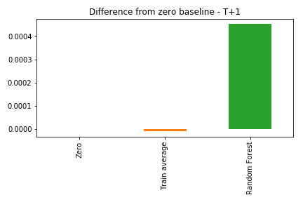
Results
As the errors from the three solutions are very close, here we look at the differences from the zero prediction baseline. Negative values means the approach does a better job than predicting everything as zero.
Returns One Day After
Returns Three Days After

The Random Forest was worse than both the average and the zero prediction. This means the model actually learned something from the data, but it didn’t generalize for the validation period.
Basically, the patterns that worked on the training period didn’t seem to keep working on future years.
But let’s give it another chance…
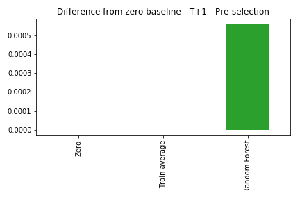
Opportunities Don’t Show Up Every Day
About 30% of our data consists of days without any patterns showing up. So an idea is: let’s only use this model when we have a pattern. This is fine, as in real life we would know if we had a pattern today or not, and could use the model accordingly.
One of the reasons to try this idea is that we can reduce some of the noise, and help the model identify the characteristics of the patterns better, leading to a predictive edge.
So here let’s select, both on training and validation, only the days when we see any pattern showing up.
One day After
Three days After
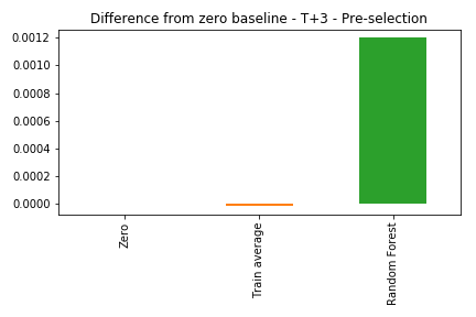
Still bad. The model can’t beat a simple average. The model can be very powerful, but if the data doesn’t have signal, it will simply not work.
The Answer is…
**NO. **
Can we claim candlestick patterns don’t work at all? Again, no. We can say it’s very likely they don’t work consistently on SP500, daily data.
Before we reach a more general conclusion there are open avenues to explore:
- What about other instruments? Can it work on low volume or low liquidity stocks?
- What happens in the lower (or higher) time periods: seconds to months?
- Would individual models for specific patterns work?
Just remember that we need to be careful: if we test enough ideas, some will work just by chance!
There is More to a Model than Predictions
The model predictions were bad, but we can look further into it to get more research ideas. Let’s see the feature importance for each pattern.
First, the native feature importance from Scikit-learn.
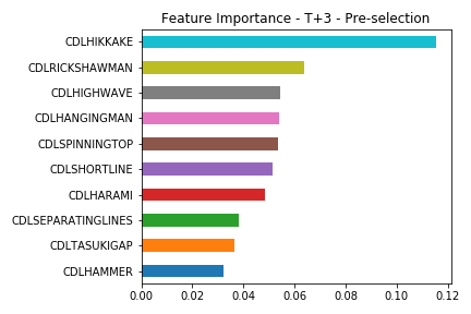
Some patterns are more important. This could mean at least two lines of work :
- The model focused too much on patterns that did well on training, but stopped working (or were just a data fluke). In this case, we should discard the top features.
- There are strong patterns in the data, that we can explore individually and may give an edge. In this case, more attention should go to the top.
A very good way to peek inside a model is using Shapley values.
import shap

shap.initjs()

explainer = shap.TreeExplainer(mdl)
shap_values = explainer.shap_values(Xtrain)

shap.summary_plot(shap_values, Xtrain)

A richer visualization changes the importance ranking slightly. Here we can see how the points with specific feature values contribute to the model output.
Higher SHAP value means it contributes to a positive return.
The Spinning Top candle appears as the most important feature. According to Wikipedia, it can be a signal of a trend reversion.
Let’s see how it relates to the model outputs

In this plot, we see a weak suggestion that, when the bearish version of this pattern appears (close less than open price), the returns on the third day may be higher than today. And the contrary when the bullish version happens.
This may or may not be an interesting investigation line.
The most important part is that we saw how we can use machine learning to validate these patterns and suggest areas for future research.
Seja o primeiro a saber das novidades em Machine Learning. Me siga no LinkedIn.